Results & exploration in the dashboard
Use the topic results page
After xelper has completed a coded topic analysis, its page brings the written summary, interactive chart, source notes, filters, and downloads together. Use the summary to understand the main findings, then use the chart to see how broadly each finding appears and how results differ between groups.
The following steps apply exclusively to Chat projects.
This page describes Chat projects that use the coded analysis model with categories, sentiment, or scale values. Qualitative Chat projects use a report view instead of the category chart described here.
Open a completed topic
Open Overview and select a topic whose analysis is complete. The page begins with the topic name and the interview-guide question. Active follow-up questions and additional instructions may also appear, so you can read the results in the context in which the answers were collected.
The result has two complementary parts:
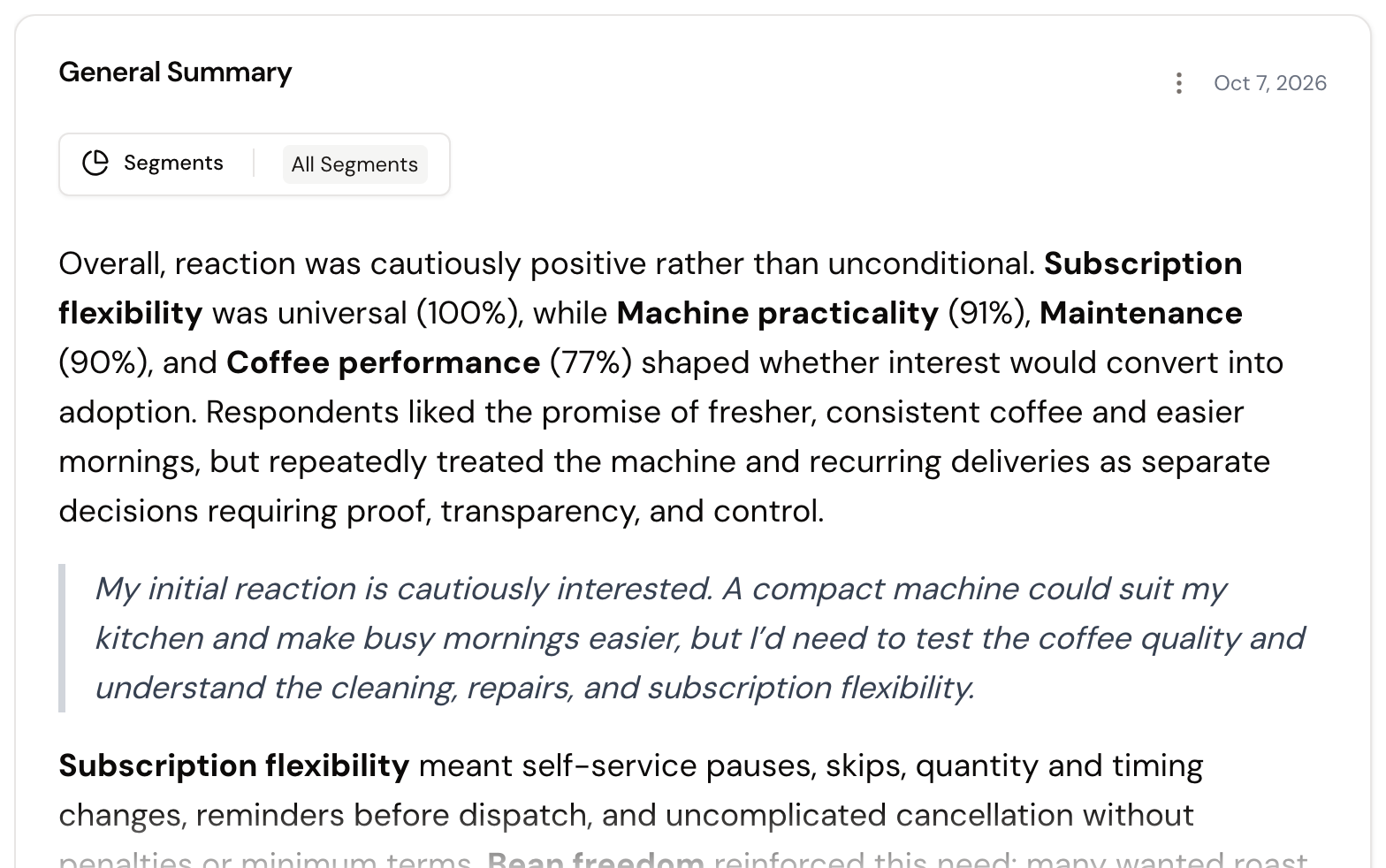
- General Summary explains the main patterns in the answers and includes selected examples.
- Categories shows the coded results as an interactive bar chart.
Read the General Summary
The summary describes the most important patterns across the topic rather than listing every answer. Linked quotes and notes provide access to the corresponding source context.
Select a quoted example in the text to open its supporting note. Show examples opens the notes used as examples in the summary, while Show notes opens the wider set of notes for the topic. In the notes dialog, you can sort and filter the table, open the source context, and download the displayed data.
Long summaries open in a shortened view. Use Show more to read the complete text. Download as .docx exports the written summary.
Read the bar chart
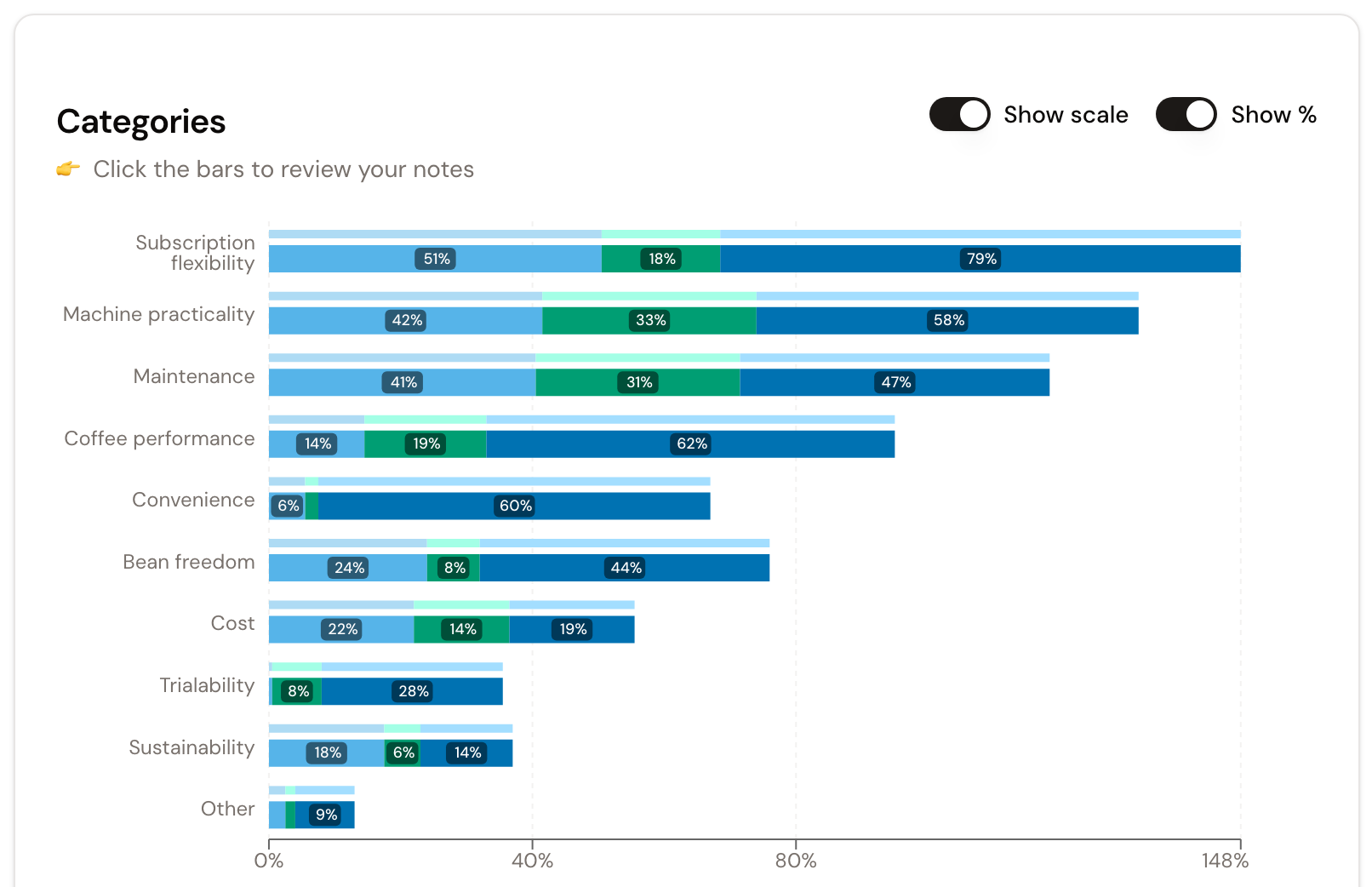
Each row represents a category from the approved codeplan. The darker bar shows the current selection; the lighter background bar preserves the unfiltered total for comparison.
The chart counts distinct interviews. If several notes from one interview belong to the same category, that interview counts once in that category. One interview can appear in several categories, so category values do not need to add up to 100%.
Use Show % to switch between:
- the number of distinct interviews represented in each category;
- the share of the currently selected interviews represented in each category.
The value n below the chart is the number of distinct interviews in the current selection and therefore the denominator for category percentages. When fewer than 20 interviews remain, the page marks the chart as a small sample.
Select a bar to open the notes assigned to that category and their source context.
Switch between category, sentiment, and scale views
The available switches reflect the analysis mode chosen before classification:
Default
Groups answers to one broad research question into categories.
One bar per category.
Sentiment
Adds positive, neutral, and negative sentiment to each category. Use it when the same subject can be evaluated in different ways, rather than for a question that already asks only what participants liked or disliked.
Stacked sentiment for each category.
Scale
Creates one distribution across ordered scale values. The questions should measure the same thing with the same scale.
Distribution of responses across scale values.
Combined
Connects one categorical dimension with one related scale, such as which features matter and how important each one is.
Scale distribution within each category.
The selected analysis mode remains part of the codeplan. Controls such as Show sentiment and Show scale change only the displayed view supported by that mode; they do not reclassify the topic.
The overall sentiment or scale distribution may also appear above the category rows. Hover over a bar segment for its exact value. Select a segment to open the matching notes.
When a topic has more than 11 categories, Top 10 only keeps the ten largest categories visible and combines the remainder under Additional Categories. Clear the switch when you need every category separately.
Filter and compare groups
The Filters area contains the segment fields and other chart filter fields prepared for the analysis. Select one or more values to narrow the chart. The darker bars and n update, while the lighter bars retain the total for orientation. Use Reset to return to all interviews.
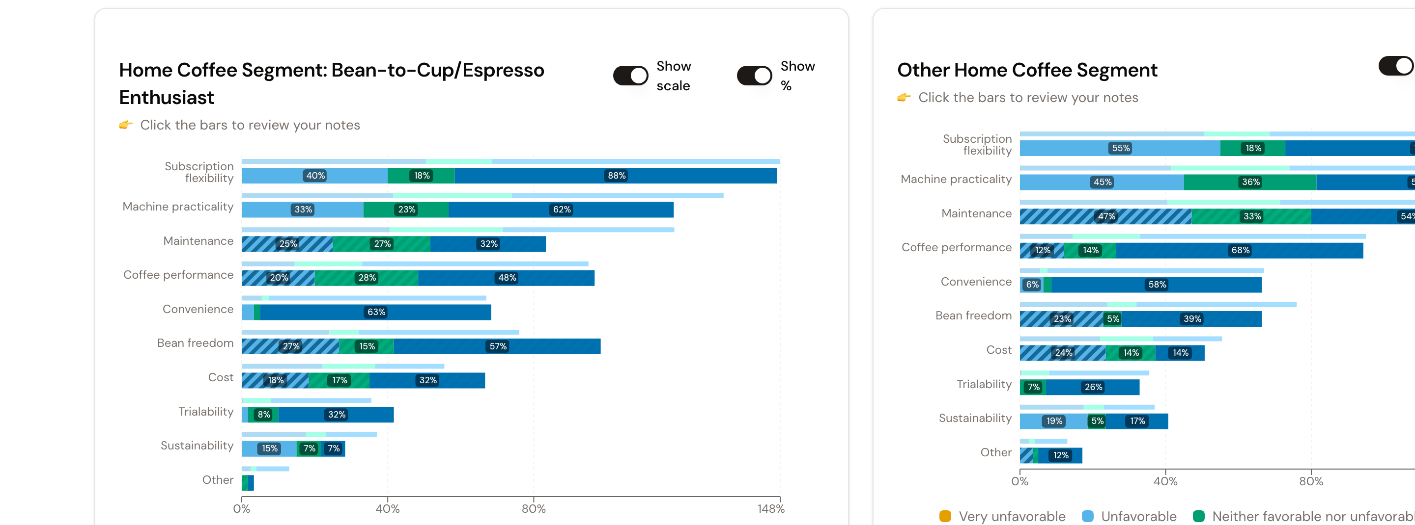
For a direct group comparison, select Compare beside a filter value. xelper shows the selected value in the first chart and combines the remaining values from the same filter in the second chart.
Understand the significance information
When two charts are displayed side by side, the collapsed Statistical Significance section appears below them. Its calculations compare the two displayed groups:
- For each category, a two-sided Fisher’s exact test compares the number of distinct interviews that contain the category with the number that do not.
- In Sentiment mode, a 2×3 Fisher’s exact test compares the positive, neutral, and negative distribution. xelper calculates this for each category and for the overall sentiment distribution.
- For numeric scales, a two-sided Welch’s t-test compares the means. This test is calculated only when each group contains at least five scale values.
- For non-numeric scales, xelper compares each response option separately with a two-sided Fisher’s exact test.
The comparison section marks a p-value below 0.05 as statistically significant and displays the calculated p-values. Categories and scale options are tested independently; no automatic correction for multiple comparisons is applied. Effect sizes and representativeness are not part of this calculation.
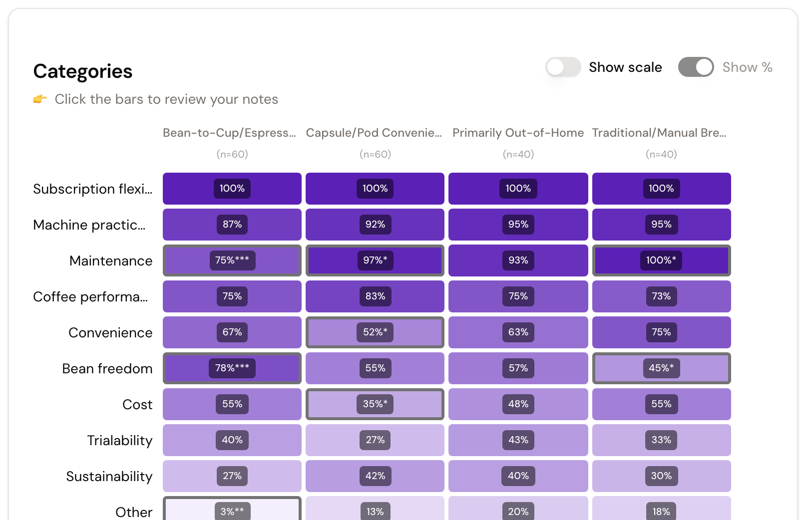
In Matrix View, each cell uses a two-sided Fisher’s exact test for the frequency of its category. The column value is compared with all other values from the same filter combined. Stars indicate the thresholds * p ≤ 0.05, ** p ≤ 0.01, and *** p ≤ 0.001.
Use Matrix View for a compact cross-tabulation of categories against every value of one filter. Each cell shows the category result for that group and opens the corresponding notes when selected. Show % remains enabled in this view so groups of different sizes can be compared on the same basis.
Download the result
The chart download follows the currently displayed chart and selection:
- Download .csv exports the displayed category, sentiment, or scale data.
- Download .pptx creates a presentation with the topic, question, current scope, sample size, and chart.
- Download .png saves the visible chart as an image.
The collapsed Codeplan Overview below the chart lists the categories and coding rules used for the result. Open it when you need to understand the boundary between similar categories.
Who can use the page
Admin, Member, and Client can use the viewing controls available to them, including chart filters, evidence links, and downloads. If topic summaries are hidden for a Client membership, the General Summary is not shown.
Next step
Once the results for every topic are ready, continue by creating the topline report.